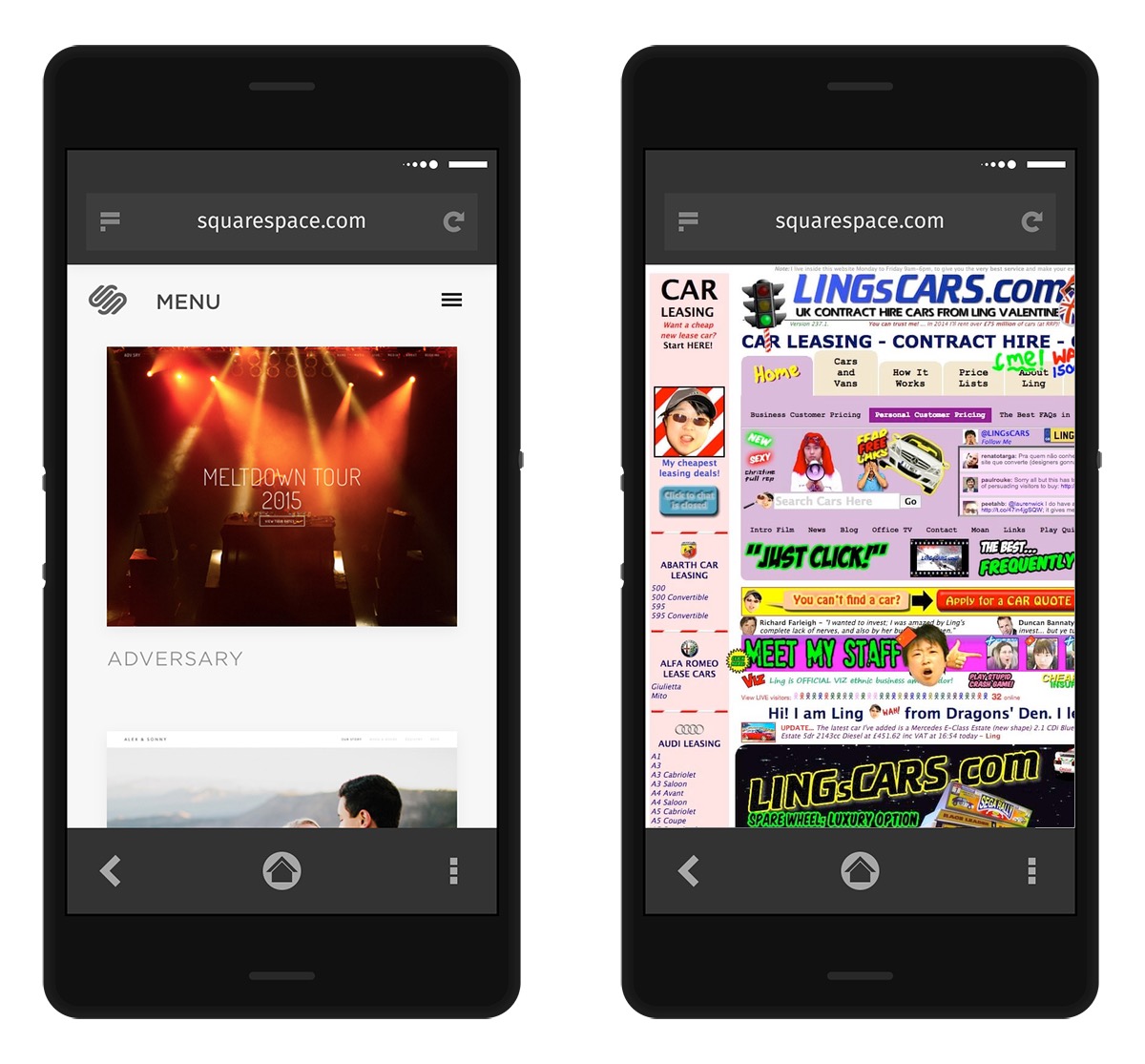
I was reading a thread on Firefox OS developer mailing-list. A mail from Przemek Abratowski was showing a mockup of a possible interface for the back button in Firefox OS (Do not look for the mail in the mail archive, it is missing. I reported the issue to Mozilla already). On the left side, that was posted on the list, on the right side my uglification of the content.

It's cool to show beautiful things to make a good impression, but if we want to be closer to the user interaction, we should probably test UIs in different contexts. Be site which are not mobile friendly, sites which are ugly, sites with Web compatibility issues. I have the feeling that would help to design not only beautiful UIs but also UIs more resilient in a frustration or uncomfortable mood of the user.
Just a quick thought.
Otsukare!