2016-03-17: See my update on Fixing Gmail on Firefox for Android.
Background Story: Gmail
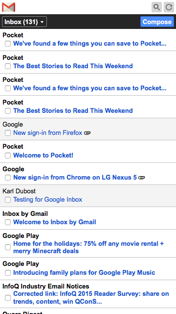
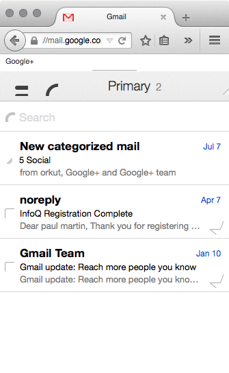
Firefox on Android is receiving a simplified version of Gmail.

In fact, we somehow chose to do this. When we added the Android version number to the User Agent string to be more compatible with the Web (Read here, that a lot of code is breaking if they detect Android but not the version number going with it), we decided to remove the Android version number for gmail. For a couple of Web properties we send a different User Agent string. In this case
 // bug 1184320, gmail.com
  "mail.google.com": "Android\\s\\d.+?;#Android;",
Google was sending to Firefox on Android, the version for Chrome which was really broken.

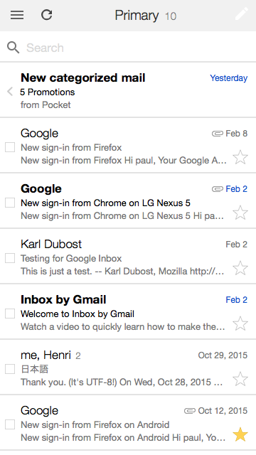
Google is fixing gmail. The current version sent to the Firefox with an Android version number looks much better. We are almost there but not yet.

border-image Fill Me
Your expert eyes have noticed that the contrast of the edit button on the top right is a bit… low. There's something missing.

Let's check what a blink rendering engine is receiving.

Ah much better. Let's find out what is happening. We open Firefox Developer Tools for inspecting the code. There is indeed a red image is specified for the editor button.

Let's check the CSS code:
.Ke {
    -moz-border-image: url(data:image/png;base64,iVBORw0KG…5CYII=) 4 4 5 4;
    border-width: 4px 4px 5px;
}
Nothing seems wrong at first sight. What is happening? Chrome basically receives the same thing but with its own vendor prefix
.Ke {
    -webkit-border-image: url(data:image/png;base64,iVBORw0KG…5CYII=) 4 4 5 4;
    border-width: 4px 4px 5px;
}
Something is missing.
border-image is defined in [CSS Backgrounds and Borders Module Level 3]. Quoting here the Editor's Draft 14 August 2015.
Authors can specify an image to be used in place of the border styles. In this case, the border's design is taken from the sides and corners of an image specified with ‘border-image-source’, whose pieces may be sliced, scaled and stretched in various ways to fit the size of the border image area.
There is a mention of the fill keyword.
This property specifies inward offsets from the top, right, bottom, and left edges of the image, dividing it into nine regions: four corners, four edges and a middle. The middle image part is discarded (treated as fully transparent) unless the ‘fill’ keyword is present. (It is drawn over the background; see Drawing the Border Image.)
So it seems that the fill keyword is missing. You may want to read also CSS border-image changes and unprefixing by David.
Let's add it to the property.
.Ke {
    -moz-border-image: url(data:image/png;base64,iVBORw0KG…5CYII=) 4 4 5 4 fill;
    border-width: 4px 4px 5px;
}

OK we got the red! Yoohoo. I asked Google to add the fill keyword last week. Hmm well… but not as beautiful as in a blink or WebKit rendering engine.
border-image The Cosmetics Details
What's happening. Let's go back to the drawing board and create a test we can play with:
border-image-moz-border-image(What Google sends to Firefox)-webkit-border-image(What Google sends to Chrome)-moz-border-image+fillborder-image+fill
Results in Firefox

Results in Blink

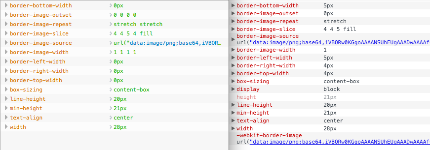
As we can see, border-image default as a nicer feeling in Blink engines. When there is a difference like this, it is always good to check the computed values in Blink inspector and Firefox inspector, to see if there are any differences.

There's a difference of interpretation for the border-width parameters, but modifying them doesn't seem to change things. Let's fork our test.
I noticed that adding a border-image-width in Firefox was giving a sense of a button. Once I have done this and modifying a bit the height and line-height, I have something which makes sense and it's working in Blink!

Basically it seems that in Blink world the border-width is taking over the border-image-width. This should be verified. Definitely a difference of implementation. I need to check with David Baron.
Otsukare!