Do you remember, a couple of weeks ago, I explained on how Gmail was broken on Firefox for Android. I was finishing my post with:
Basically it seems that in Blink world the border-width is taking over the border-image-width. This should be verified. Definitely a difference of implementation. I need to check with David Baron.
I was wrong, it's a lot simpler and indeed David helped me find the culprit.👹
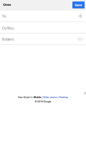
Let's take another UI element of gmail exhibiting the same issue: The new email interface. Currently, we get in Firefox Android (without user agent override), the following rendering:
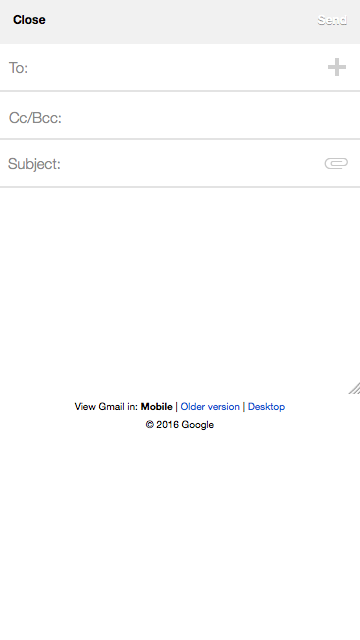
The send button is barely readable.
A Solid Border
Let's open the Firefox Developer Tools and inspect the content. David told me:
The underlying problem is, I think:
- https://bugs.chromium.org/p/chromium/issues/detail?id=356802
- https://bugs.chromium.org/p/chromium/issues/detail?id=559258
Or, to put it another way, the site should also specify:
border-style: solid.
Let's check this by adding border-style: solid to the "send" markup.
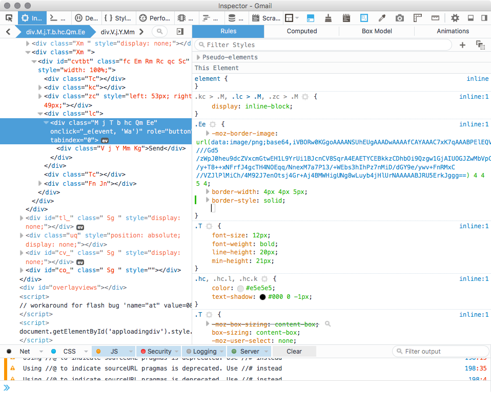
And let's check.
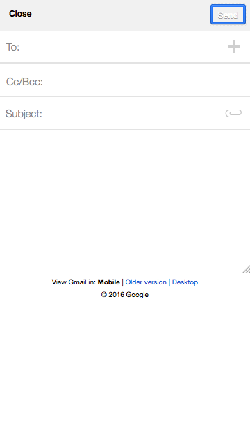
Much much better, we have a thick round corner around the send text. Ah yes it's not finished, but we already did that last week, by adding fill to the -moz-border-image. Let's replace at the same time -moz-border-image to border-image to be future compatible.
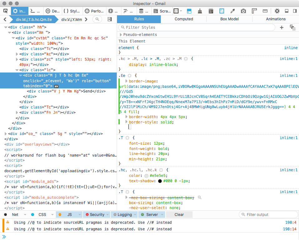
And we get the following rendering:
Next Step?
Sending an email right now after publishing this to Google to fix this and hopefully we can remove the UA override.
Update 2 hours later. Bug filed at Google's bug tracker: b/27707860.
Otsukare!