Chintai is yet another Japanese Web site with plenty of WebKit issues, but in this case I want to focus on width rounding in CSS. Let's see this navigation navbar in Firefox for Android (aka Gecko).

And in Blink (Chrome, Opera).

What's happening?
<ul class="btn_read tapon">
    <li><p><a href="/info/inquiry.html"
              target="_blank"
              class="ui-link">ご意見・お問い合わせ</a></p></li>
    <li><p><a href="/info/kiyaku.html"
              target="_blank"
              class="ui-link">利用規約</a></p></li>
    <li><p><a href="/info/privacy.html"
              target="_blank"
              class="ui-link">個人情報の取り扱い</a></p></li>
    <li><p><a id="pcLink" href="javascript:void(0);"
              class="ui-link">PC版 マイナビ賃貸</a>
            <input id="pcUrl"
                   value="https://chintai.mynavi.jp/" type="hidden"></p></li>
</ul>
The CSS used for this part too:
ul.btn_read li:nth-of-type(2n+1) {
    width: 49.99999%;
    border-right: 1px solid #CCC;
}

ul.btn_read li {
    display: table;
    float: left;
    width: 50%;
    height: 50px;
    background: gradient(linear, left top, left bottom, color-stop(0%,rgb(0,165,231)), color-stop(100%,rgb(0,142,217)));
    background: -webkit-gradient(linear, left top, left bottom, color-stop(0%,white), color-stop(100%,#EFEFEF));
    border-bottom: 1px solid #CCC;
}
We see here that the person careful tried to fix the width so the li elements would fit inside. The 49.99999% smells already bad compared to using 50%. We can also notice the invalid gradient property. The correct value for the gradient is (easy to get with the CSS Fix me tool):
ul.btn_read li {
  /* … */
  background: -webkit-gradient(linear, left top, left bottom, color-stop(0%,white), color-stop(100%,#EFEFEF));
  background: linear-gradient(to bottom, white 0%, #EFEFEF 100%);
}
But back to the rounding of the width. What is happening? Let's say the viewport is 360px wide. In both devtools, the ul takes 100% of the viewport size. All is good.
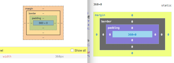 (blink left, gecko right)
Let see the first li aka li:nth-of-type(2n+1) (width: 49.99999%;)
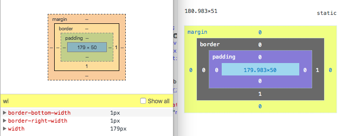 (blink left, gecko right)
and the second li (width: 50%;)
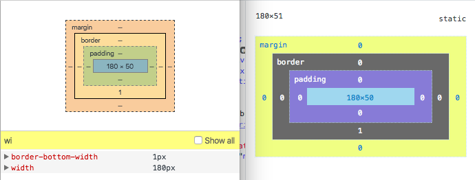 (blink left, gecko right)
Oooops… In Gecko, we get 179.983px + 1px + 180px = 360,983px. Wider than the viewport.
Math is hard
Update 2016-05-26: How CSS width is computed in Gecko?
At least, for browsers it seems. I'm taking a calculator.
360*(49.99999/100) = 179,999964. Yet another result. Hmmm let's reverse it to see how Gecko rounded the value.
(179.983/360)*100 = 49,995277778. what!?
Or maybe it's the devtools rounding the value in the UI? Ok let's try to see what the console is given us in Gecko.
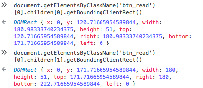
width: 180.98333740234375(because the 1px border). The rounding in the devtools is correct.width: 180
if I take this value, that would mean that Firefox used something for the width which is 49,995371501%
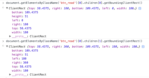
width: 180for bothli. At least consistent with their strange rounding.
Widths in CSS are not mathematical widths.
The Correct Way To Compute This Width
The front-end developer by now understands that he or she not use this kind of percentages for this issue. What can we do to solve this issue?
The simplest would be to use calc()
ul.btn_read li:nth-of-type(2n+1) {
    width: calc(50% - 1px);
    border-right: 1px solid #CCC;
}
but I suppose that at the time the Web site was done, this option was not available.
The other working solution would have been to set box-sizing: border-box; so that the border is included in the computation of the width. This removes the need of the 49.99999%
ul.btn_read li {
    display: table;
    float: left;
    width: 50%;
    height: 50px;
    background: linear-gradient(to bottom, white 0%, #EFEFEF 100%);
    border-bottom: 1px solid #CCC;

    /* set box-sizing on li */

    box-sizing: border-box;
}

ul.btn_read li:nth-of-type(2n+1) {
    /* width: 49.99999%; */
    border-right: 1px solid #CCC;
}
Otsukare!