Reading The GDS blog post on how to prototype in the browser, I realized that it's always good to explain little tips for the benefits of others. Their technique is something I use on a daily basis for modifying content, evolving a design, etc.
When diagnosing on webcompat.com, I often use a trick for having a better understanding of the way the elements flow with regards to each other.
Using CSS outline for visualizing
David Lorente reported an issue about the menu of Universia. Basically two items where missing in the main navigation bar of the Web site.
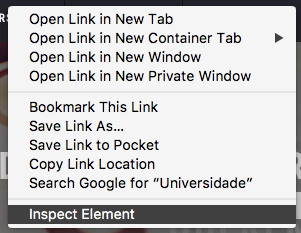
Hovering the menu with the mouse and doing ctrl+click to get the contextual menu, I can choose inspect.

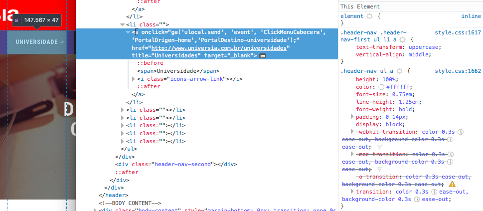
It opens the developer tools and place the cursor on the right element and displays its associated CSS.

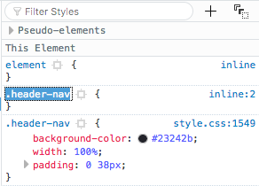
For this particular issue because the elements were not immediately visible. I decided to add a higher z-index in case there were hidden by another layer, but more specifically. I selected the wrapper element for the navigation bar <div class="header-nav"> and headed to the + sign on the right side.

Clicking on it will help you to add a new rule for this selected node (element) in the inspector. In this case, it will add .header-nav.

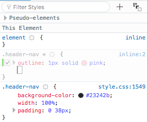
which I usually edit for adding all the children of this node with .header-nav *. Then I proceed to add an outline CSS property with a color which will give an acceptable contrast, helping me to understand what is happening. In this case outline: 1px solid pink

The result helps to visualize all the children boxes of the div.

It is now a lot easier to understand what is going on.
Why CSS outline?
The reason I use CSS outline is that they do not participate to the intrinsic sizes of boxes and does not destroy the flow of boxes. It just makes them visible for the purpose of the diagnosis.
What are the tricks you are using which seems obvious to you? Share them with others.
Oh and the site has been fixed since.
Otsukare!