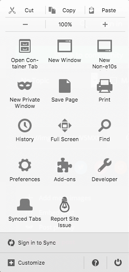
Ok, Houston, Mozilla, we've had a problem here. We (Dennis, Eric and Mike from the webcompat team) recently released a new button in Firefox Nightly: Report Site Issue.

The button who was previously available in Firefox Nightly Android is now available on Firefox Nightly Desktop. The button intent is
- for the users: help them report Web compatibility issues.
- for the Webcompat team: to be aware of what issues users have with Web sites they would not have in another browser and comes up with a remedy be on the side of the browser or on the side of the Web site.
Once you click the button, it sends a report to webcompat.com with a screenshot, the URL and the details of the user agent. The button is not in one's face. It is hidden in the three stripes menu on the top right.
Perfect Storm
So the button was released in a Firefox Nightly version of the week-end. On Monday morning, the first two persons to triage the bug are Eric Tsai (Taiwan) and me (Japan). We welcomed a flood of crashing issues related to video on Windows 10. It's a perfect storm. The combination of a bogus code in Nightly (which is the purpose of Nightly) and the release of the new button made our cursing during the day on IRC.
We can't do a lot of things about crashing issues without clear steps to reproduce and/or a trace.
A UI Step Back
While we were processing the flow of incoming bugs, a new one every 10 to 20 minutes, we started to discuss with Eric about what was wrong and what could be done.
Some thoughts:
Button Label
The button says Report Site Issue This is a very generic label, which covers indeed all type of issues. And indeed a crash, a security issue, a certificate issue can all be felt as something interesting to report.
Reporting Form Wording
The form of webcompat.com tries to reduce the scope of this report, but still it doesn't say anything specific about web compatibility such as for example does it work in another browser? (We want to fix this).
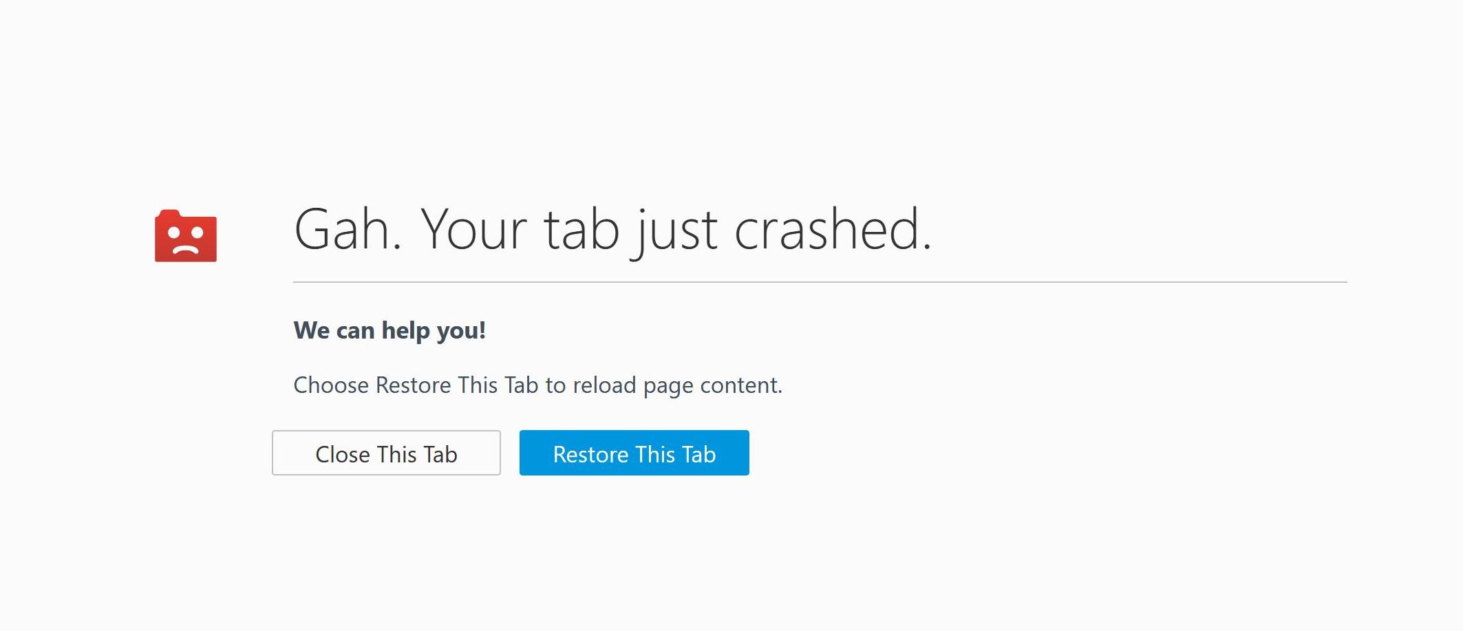
Crash Tab UI Next Actions
The crash tab UI is leaving the user with two choices:
- Close this tab
- Restore this tab

Given what happened on Monday, it seems that users want to report that there was an issue. They went through all the trouble of trying to find a place where they could report it with a button they didn't know it existed (because the button had just been released).
Firefox Help Menu
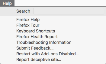
Firefox has another piece calling for actions from the user in the Help menu.

More specifically, we can find:
- Troubleshooting Information: It redirects to the about:support page giving information about the configuration of the current browser, which contains a link to support (here for example Firefox 52 on mac). You can then report an issue with more details if you head to "Fix slowness, crashing, error messages and other problems", but that's a long way to give precise feedback for an issue the user has right now.
- Submit Feedback: It sends the user to a choice of smiley faces and once selected one of the faces gives a form to give an opinion with a free text area. There is not really a way to leave a contact information if it's a specific issue.
- Report Deceptive Website: This one leds to a google Web site asking people to report on sites which might try to steal information and so on. I have the feeling that most people would not understand deceptive. I wonder about the number of people it requires at Google to process those.
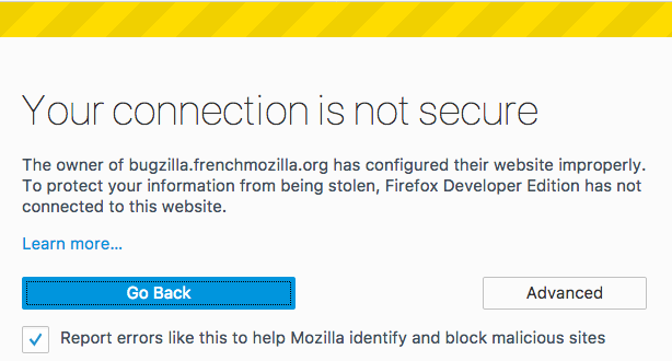
SSL Issues
There is also another screen asking users for feedback about wrong unsecure connection. At least this one is automatic, and has a checkmark for automation, but also an advanced button for letting people give more information.

What Do We Do?
So it seems that the Report Site Issue button is the most direct choice that users have when they are having an issue, but it also means that all sort of issues might land on webcompat.com with the double effects of
- being out of scope for the webcompat team
- being missed out by other teams at mozilla where it would be valuable for them.
So we need to find a better to gather feedback maybe in both reducing and atomizing. Maybe the report site issue is larger than webcompat.com and it should have an intermediate screen asking what kind of issues the person is reporting and redirecting to the right place. Hard to know. It needs UX and user testing. It's an interesting problem to have.
For now, we will continue to monitor on webcompat.com what this button generates.
Otsukare!