My browser is my like an office room with desk and shelves, where the information is accessible. Information is stacked, accessible, sometimes open and browsable at glance and some deep on the shelves. But how would I want to have access it in the browser.
Currently we bury the information of tabs and bookmarks in a big bind of context without giving any help for managing apart of having to go through the list of pages one by one. No wonder why people feel overwhelmed and try to limit the number of tabs they have opened. Because big numbers rely on external tools (Tree Style Tabs, Sidebery, Containers, etc) which do not go far enough to manage the tabs.

Some contexts
It started with a message from Glandium sharing an article from Joseph Chee Chang with the title: When the Tab Comes Due. Tabs! Love Tabs. Reading the PDF brought some strong nodding.
Tabs should better reflect users’ complex task structures.
One potential design space is to bootstrap such mental model repre-sentations with minimal user effort by identifying their intentionsusing their navigation patterns. For example, a set of tabs openedfrom a search engine query is likely to support the same information needs; or, a set of tabs opened from a top-10 list article arelikely competing options under the same category. Capturing andorganizing tabs using such structures has the potential of betterorienting users and providing better support for task progressionand resumption.
Allow users to externalize their thoughts and synthesize information across tabs.
More directly, a recent survey showed thataround half of their participants (49.4%, N=89) use spreadsheets togather evidence and take notes across multiple online informationsources to compare options (e.g., products or destinations) to helpthem make decisions. However, current browsers treat tabs asindividual silos and provide little support for cross-referencing andcollecting information between webpages. Using external tools,such as word documents and spreadsheets, creates a disconnectin users’ workspace, and can incur high cognitive and interactioncosts when trying to copy and paste information to synthesize themin a separate document
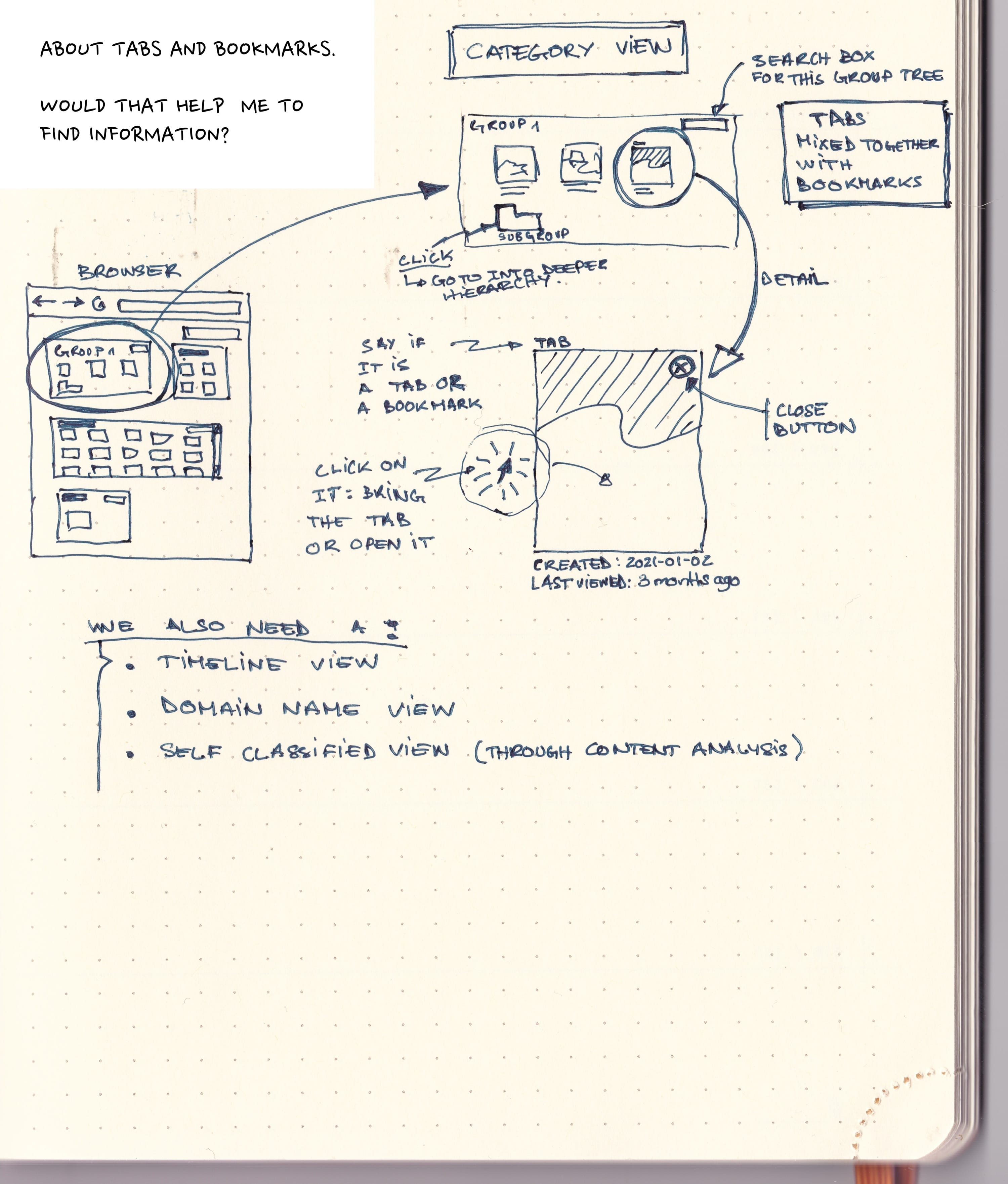
Sketch
The article made me think about tabs and bookmarks, in our browsers UIs, these are separated. Probably it should not be. A bookmark is just a closed context, and a tab is just an opened context. But they are basically the same. The UI to access them is completely different, the information to filter them is also totally different. Why?
So I was thinking how could both world be mixed together.
- Make the bookmarks more visual though thumbnails.
- Make the tabs manageable through trees and categories and gives them the concept of dates (created and last opened) and show these dates.
- Add on top of this full text search on the full set (or subcategory) of tabs/bookmarks (we need a new name).
- Search "Gardening" for tabs opened in between February 2021 and May 2021.
- Search "Curry" for tabs in my Thailand category
- Give the notion of views
- By tree (the sketch below)
- By timeline (Year, month, days). Think photo management software. Sure I opened this tab after this date, during this trip, etc.
- By geolocation (tabs opened when I was at home or in this cafe) Sometimes we memorize the information through the external context we where in.
- By labels or keywords that you may have added.
- By automatic classification of content. Machine Learning is all the rage, why not using the capabilities that OS provides more and more for running Machine learning to classify the content or even embark one.

Comments
If you have more questions, things I may have missed, different take on them. Feel free to comment…. Be mindful.
Otsukare!